

A revamped UI and responsive design capabilities, now in Google Web Designer
Posted:
Tuesday, May 3, 2016
Today, we’re excited to introduce an entirely revamped UI for Google Web Designer and responsive design capabilities that help creative developers make true responsive ad units a reality.
You can customize the UI so it fits the way that you work best:
For example, say you want to build an ad that can work in a large full screen space on a mobile phone, in a regular 300x250 space on a desktop, and in a small 300x50 space. You can build a single ad unit, then define the styling and layout the ad unit should use for each size. So when the ad renders on a screen, it recognizes the size and renders the correct styling and layout for that size. Of course, this works on a sliding scale, so all sizes in between the cut-off points will render appropriately as well. Learn more.
Example of the GWD UI for building responsive ads:
The resulting ads for the most popular sizes:
We’re really excited to bring this new and improved Google Web Designer to creative developers. We hope the responsive design capabilities help you create ads for multiple sizes more easily, so you can bring your experiences to life across screens.
As a reminder, if you’ve already downloaded Google Web Designer, it will automatically update to reflect these new features. If you haven’t yet downloaded the tool, you can download it for free here.
New UI lets you customize your workflow
We’ve given the UI a Material Design-inspired makeover, to make it easier and sleeker for you to use.- Re-order and move the panes on the right for Color, Library and Components panels as easily as you do for your browser tabs. You can separate them into panels of their own, or combine them onto one panel.
- Choose from ten new color themes for our code editor. (So you can see your code in whatever color doesn’t hurt your eyes!)
- Choose from a number of popular key mappings (keyboard keys mapped to on-screen functions) to make code view even easier to use.
- Set default text styles (font, size, color) and apply them throughout a single document and across documents.
- Save these stylistic preferences for next time. When you log in again, the tool will remember your last-saved customizations.
- Bonus: When you add a component to your stage, you can preview it with the actual asset, instead of as a gray “placeholder” box. This way, you get a better sense for how your creative will actually look.
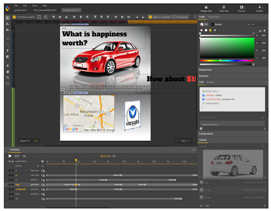
Media rules for responsive ad units
Media rules help you build a single ad unit that can change its layout based on the height and width of the screen it shows up on. The easy-to-use interface creates color-coded ranges of ad sizes (see the red, yellow and purple bars along the top of the gif below and the blue and green bars along the left). You can build rules into your ad unit around which creative assets and layouts should show up for each size range.For example, say you want to build an ad that can work in a large full screen space on a mobile phone, in a regular 300x250 space on a desktop, and in a small 300x50 space. You can build a single ad unit, then define the styling and layout the ad unit should use for each size. So when the ad renders on a screen, it recognizes the size and renders the correct styling and layout for that size. Of course, this works on a sliding scale, so all sizes in between the cut-off points will render appropriately as well. Learn more.
Example of the GWD UI for building responsive ads:
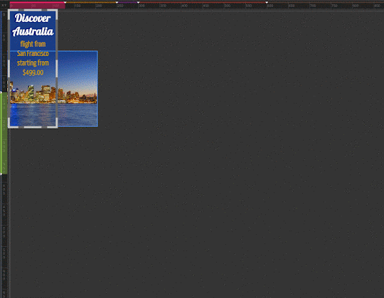
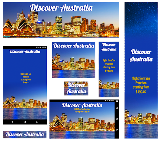
The resulting ads for the most popular sizes:
Want to learn more?
Our training and engineering teams are hosting a hangout on air on May 26 @ 12pm ET to walk through these features in more details. RSVP here.As a reminder, if you’ve already downloaded Google Web Designer, it will automatically update to reflect these new features. If you haven’t yet downloaded the tool, you can download it for free here.
 |
Posted by Becky Chappell Product Marketing Manager, DoubleClick |